A Fresh Take on Sunday School Design at Granger Community Church
Pastor Tim Stevens has no qualms about leaving some church traditions behind. “For decades the prevailing philosophy was to paint Sunday schools in plain colors, creating a subdued environment that wouldn’t get the kids too excited, so they would sit still and listen to the stories. We weren’t interested in that. We wanted an environment where the kids would be dragging parents back to church, rather than screaming when they got dropped off.”
Stevens is executive pastor of the Granger Campus for the Granger Community Church, in Granger, Indiana. GCC had very dynamic adult services, with music, drama, and production values that had proven very popular. Why not create a Children’s Center that was just as appealing, an environment that makes them want to come back again and again? A Fresh Take on Sunday School Design AT GRANGER COMMUNITY CHURCH “One example I’d cite is the McDonalds’ Playland,” says Stevens. “Adults don’t go there because they love the food. They go because their kids are dragging them there. I’ve got a nine year old and a 12 year old, and that’s still their favorite place to eat, because there’s an environment built especially for them.”
To create such a place, GCC sought out architectureisfun. Run by architects Sharon and Peter Exley, the award-winning Chicago-based firm is well-known for its expertise in designing educational and interactive environments for children and families. “
Working with AIF was an easy sell,” says Stevens. “We have dozens of volunteers, including teachers and education professionals, who help us with the kids on weekends, and we had been brainstorming about how to create great learning environments and picking themes for the different areas.
“Peter and Sharon stretched us even further. They had been working on museums and very interactive environments, but not as much with areas for large group instructional time. We needed room for 60 kids to enjoy a 15 minute talk. They were great, they were so open to what we needed. And we were open to them bringing concepts we never thought of.”
“Our clients often speak of all the above pragmatic concerns and sometimes, like at Granger Community Church, we are challenged to create something really special, like a new model of Sunday school,” says Sharon Exley. “Beauty should not be absent from our children’s lives. We ask, “How can we ignite the imagination in thoughtfully designed spaces – places where children say, ‘wow, this is for me!’”
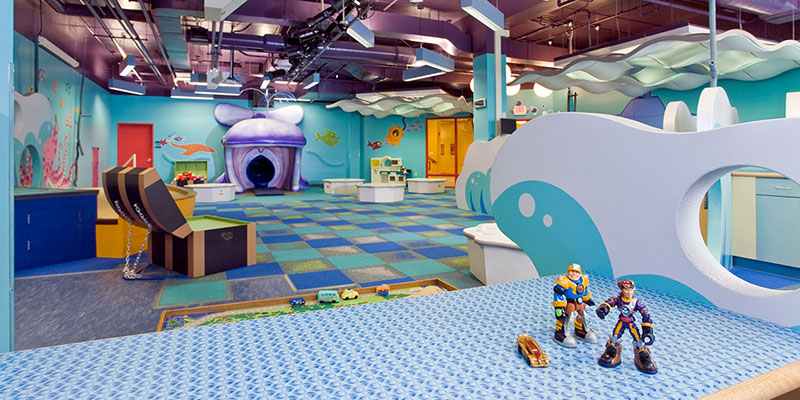
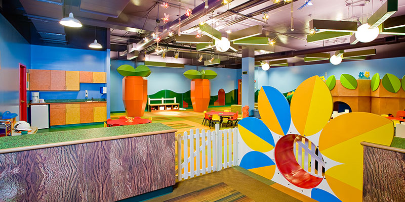
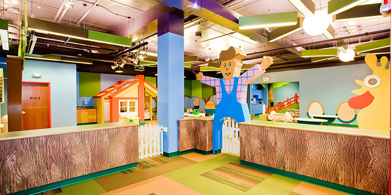
The design of each of the rooms – some quite sizable – is tailored for kids of a certain age, complete with appropriate themes and play areas. Smaller children have more one-on-one and playtime than older kids, who have more class time.
DURABLE DESIGN
Stevens says GCC consulted its facilities management housekeeping personnel to make sure the materials chosen met their standards for maintenance and upkeep. A big part of AIF’s palette is imagined with high pressure laminates from Wilsonart, proven to perform and delight in educational environments.
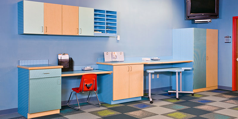
“We don’t just consider laminate to be just a surface material,” says Sharon. “We consider it a design tool, a way for us to apply interest in shelving, cabinetry, and otherwise pedestrian elements. We use it to accentuate the interactive ‘wow’ elements.”
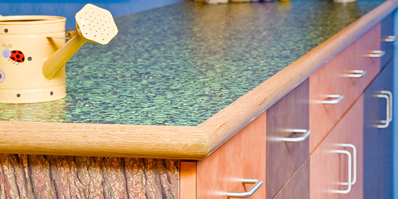
Several designs from Wilsonart’s Indie collection helped bring GCC’s Children’s Center to life, including Grass, Bark, and Rollerball. Several colors from the company’s standard Brush Series were also used.
“Working with Sharon and Peter, we were coming up with some pretty fantastic ideas, beautiful concepts with a lot of energy. We had to keep in mind that at a certain point it would become our responsibility, so we wanted to be sure the cabinets would stand up to being bumped by carts, and to some pretty intense wear and tear; we certainly didn’t want to be resurfacing every two years.
“We planned for a seven- to 10-year life cycle on the themes. We’re confident that the Wilsonart designs Sharon and Peter used will look good for the duration.”
“Maintenance is a huge issue for our clients and when our projects are successful, the number of users is often more than even anticipated,” says Sharon. “We use products we can count on, over and over again, but we use them in creative fashion.”
‘HUGE’ RETURN ON INVESTMENT
“When we opened the old children’s center, the church was 15 years and we had a ratio of four adults for every child,” says Stevens. “After the redesign, we instantly jumped to one child for every three adults. Kids were hearing about it in school, and young families were coming out of the millwork.
“The impact of our new Children’s Center has been huge. We’ve realized our goals, and then some, in large part because we decided to invest in great design created specifically for kids.”
Click here to download a PDF of this case study.



Sign In
Register