Finding A Way For Higher Education
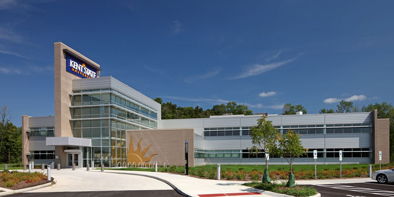
Higher education is, in one sense, about finding a way to a better future. It is not always an easy course. To earn a credential, a student must have direction, dedication and an idea of what a successful future looks like. Institutions of higher learning are expected to embody those same traits. A great example of an edifice matching this ethos is the new Kent State University Regional Academic Center in Twinsburg, Ohio.
The new KSU Regional Academic Center, which opened for the 2012 Fall semester, is an expanded, modern presence for the institution. Located 26 miles away from the main campus, the Regional Academic Center is strategically situated within a 30-minute drive of one million people, with highway access and established industry and business infrastructure in the vicinity. The facility’s specialization – Nursing and Allied Health Care – offers coursework geared toward freshman and sophomores. In short, the Academic Center’s concept is forward thinking and poised for growth. And those two ideas were the design objectives that Dr. David Mohan, Dean of the Geauga Campus of Kent State University, gave to the project’s Architect, Gerald Payto.
“The Dean wanted us to create an image that the students would relate to so that they would want to come here,” says Gerald Payto, Principal of Payto Architects, a Cleveland, Ohio based firm that has extensive experience in higher education, including many projects for Kent State University. “He wanted it to be of the future, to excite younger students about coming to the space and staying in that environment. The new facility replaces a 1920s-era building on a different site. That old facility was sort of sad; students would sit in their cars to study between classes. The idea of socialization and coming to a college campus to be with other students, of having a place to linger and study, was very important. Our objective was to create the right venue for that experience.“
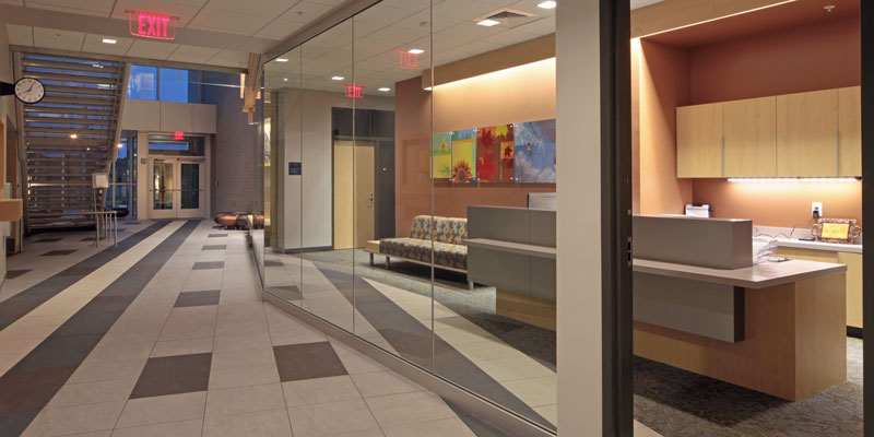
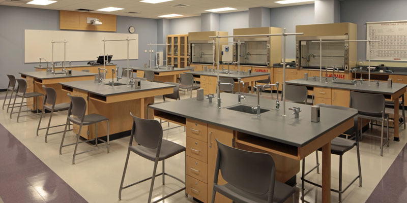
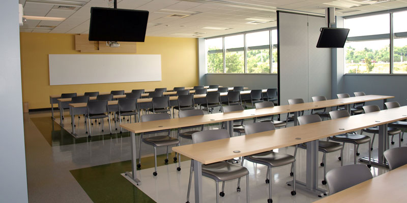
The practical specifications for the new building nearly doubled the size of its predecessor, with 22 classrooms, three lab spaces, administrative offices and a student lounge. Additionally, the project is LEED-Gold Certified. The challenge was to make the Regional Academic Center attractive enough to fill the 44,000 square-foot space and comfortable enough to encourage students to stay on campus, all the while orienting students and visitors to the purpose and importance of the facility. And the budget was strict. Gerald Payto drew upon the expertise of Point of View, an interior design firm specializing in specifications for commercial interiors to help finish the three-story structure.
Way Finding
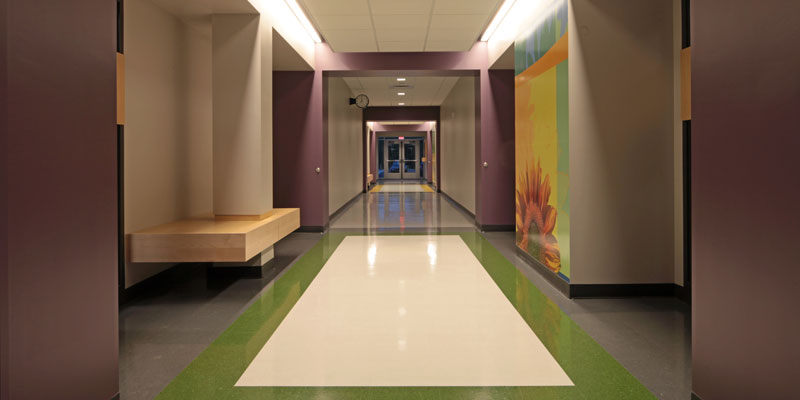
“I was traveling in the winter, trying to figure out how to make this building a meaningful space for students and faculty,” says Christie Payto, Designer for Point of View, “and I was thinking about the importance of way-finding, philosophically as well as how it relates to the location and layout of the building. The second floor emulates the first floor, and there are four different sections to the building. I realized that there are a lot more colors in the winter landscape than most people realize. That is where the idea for the seasonal theme came from.”
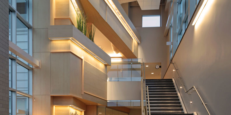
Each separate pod of classrooms is adorned with a mural depicting a seasonal scene, which connects to the 11-acre, heavily wooded site. Tying those elements together is a three-story feature wall clad in Wilsonart® Kensington Maple High Pressure Laminate (HPL).
“Using HPL on the feature wall allowed us to make a big impact on a limited budget,” says Gerald Payto. “The initial concept was not only to create this entrance, but also a spine all the way through the building that led through the major circulation patterns. We thought about that wall a great deal. We knew we couldn’t run it parallel because it would lose its grandeur upon entering. And we knew we didn’t have the room to position it so that the wall was engaged head-on upon entering the building. So we skewed it at an angle to give it more prominence, and also so that it acts as a directive, guiding students on this path through the building.” This grand wall and its forced perspective make a statement by contrasting with the rectilinear lines of the rest of the building.
Although the wall practically informs the circulation of the building, and HPL can contribute to LEED points, it also became the focal design element. “Of course we wanted something that is very durable. And we believe that today’s HPL is absolutely gorgeous as well as economical. The Wilsonart HPL just lets us do things we wouldn’t be able to do, in some cases, with veneer,” says Gerald Payto. “This building has no humidity control, and HPL is able to survive drastic shifts in humidity that would quickly damage wood. Plus, if you put real wood in any application you have all kinds of finishing to do, then re-finishing. And in higher education, hospitals, a lot of corporate settings, people just don’t have the time. We have found that once it goes into place, that is how clients live with it. One of the great things about the Wilsonart® Laminate is you install it, wipe it off, and it just looks great for years and years.” The durability of the material makes it an excellent specification for horizontal and high-traffic applications, as well. Wilsonart’s Kensington Maple Laminate is also built into the casework and desking in the facility.
To the interior designer, the look and the feel of the material are also extremely important. “It brought a significance to that space that would not have been there without the wall,” says Christie Payto. “We also liked the cleanliness of it. It looks clean, and the Kensington Maple has that soft matte sheen to it. There is a lot of natural light shining on the wall as well, and we don’t have to worry about it fading. That is a big plus over real wood veneer. “To emphasize the elegant Kensington Maple design when the sun is down, the design team installed soft wall-washing lamps that light the surface. And because of the scale of the feature, they had some fun adding interest to the visual by insetting panels so that the grain runs in different directions with intriguing intersections, shapes and sizes. Planters were also built into the feature, emphasizing the natural feel of the space.
“The Wilsonart HPL looks very warm and comforting. It is very welcoming to students, faculty, parents, whoever visits the building, “says Gerald Payto. We like the fact that people come in and say, ‘Oh my goodness, this wood wall is beautiful!’ and I say ‘yes it is.’ It is great that people actually think we went through all the trouble and cost to build a wall that is three-stories tall. And that is the real proof of Wilsonart Laminate. People believe that it is wood, yet it is more durable. We use HPL all the time because it is consistent. The design possibilities are endless. Also, we know that once it is in place it is going to be there for a long time, and even with no maintenance it is going to hold up and look great.”
Heading into its second semester, it appears that the Kent State Regional Academic Center really has found the way to bringing education to more people. Projected enrollment indicates that there could very well be reason to add an additional facility in the near future. And so far, the response to the new building is very positive. “I think it works well, not just because we did it, but because of the reactions we get from the client, the professors and the students,“ says Gerald Payto. They are very enamored with it, and that is one of the reasons why Christie and I do what we do.”
Click here for a PDF of this case study.



Sign In
Register