A Soft Landing for Traumatized Kids
Designing a space that engages kids is one thing. Making it kid-proof is even tougher. Bringing these two elements together in a building that serves as a first stop for kids just extracted from dangerous and abusive situations is a feat of imagination, engineering and passion.
A Kid’s Place is a unique, 60-bed facility for abused, neglected, or abandoned children from birth to 18 years, in Brandon, Fla. Designed to be a soft and stable landing for kids who suddenly find themselves in Hillsborough County’s foster care system, it offers medical and dental care, therapy, education and housing for up to a month, while they await placement in a more permanent foster home.
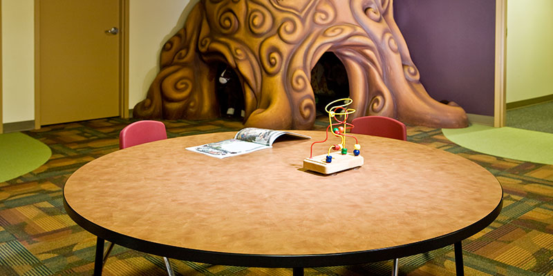
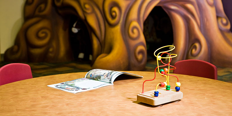
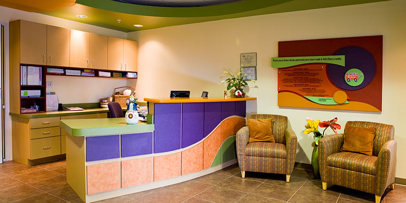
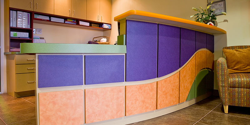
The first thing kids see when they’re brought in is the reception area, in soft, festive colors, anchored by a circular desk, and framed in flowing lines. To the right is the intake, or transition room – it’s every kid’s fantasy playroom, filled with toys, a life-size tree with a fort in its trunk, video games, books and a TV. Further down the hall, there’s a complete medical exam room and behind the reception area, is a large dining hall with a large mural. This main building also houses classrooms and administrative and staff offices. Bedrooms are distributed throughout five other buildings on the 5-acre property.
“A Kid’s Place has to be a comforting environment because a lot of these children come from abusive situations, and their behavior can be unpredictable,” says Mary Currie, whose firm, Edge Architecture, designed the facility, largely on donated time. “They might be hyperactive, rambunctious, or even violent.”
Currie, a licensed interior designer in Florida, had a few basic requirements for the materials used to create the space: they had to be extremely durable, easy to clean, and available in great, kid-friendly colors and designs.
“After touring other facilities for abused kids, we found that the materials used were not adequate and looked very bad after just a couple of months of wear. Many of the fixture and furniture surfaces were painted, which just doesn’t cut it in an environment like this.”
The search for more durable surfaces in great colors and designs led Currie to Wilsonart Laminates. “Wilsonart’s colors and textures are very appealing, and they always seem to have a great variety,” says Currie. “We also get a sense of comfort because the company has been around so long, and have always had great service.
“We wanted this space to have nice colors and visual textures of different scales, combined for a good sense of balance. We started with primary colors and expanded on that theme, to soft oranges, purples and greens, all calming colors – nothing too intense that might make kids more excited. These are colors they can relate to, and combined help create a space that’s both soothing and engaging.”
Beginning with the reception area, flowing lines run from the reception desk to the walls to the ceiling, with white tiles revealed like clouds through a green forest canopy opposite an earth-brown floor.
“The transition room is a little cozier and more calming with browns and greens,” says Currie. “The tree signifies a family tree, because all kids need to have family. This is the first place the kids go, where they’re assigned a counselor or an intake person. It’s where counselors talk to and observe the children.
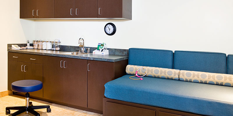
“From there a lot of them need a physical exam. Rather than move them again, adding to the trauma, there’s an exam room and treatment room right down the hall. It’s done in blues and browns which, again, are very calming.”
These themes and materials are echoed throughout the facility’s administrative, educational, and residential areas.
“Our client is very happy because it’s been over a year now, and word continues to come back that it still looks like it’s brand new,” says Currie. “That’s what we were going for, a space that’s very durable enough and engaging for the kids. Working with laminates also helped keep us easily within the tight budget of a not-for-profit operation like this.”
Edge Architecture normally specializes in corporate headquarters, medical labs and office buildings, office environments and retail spaces. Currie says Wilsonart figures heavily in many of their projects.
“Great colors and patterns aside, we like working with Wilsonart because of their service,” says Currie. “We will not spec’ materials for projects if the supplier hasn’t visited our office. If they’ve taken the time to meet with us, then we know we’re going to get good customer service.”
Click here for a PDF of this case study.



Sign In
Register