It is somewhat tongue-in-cheek when Landon Lawson, Project Director for Vanguard Health Systems quips that “Vanguard is the Vanguard of outcome-based quality healthcare,” but the company is certainly part of what is driving the big philosophical changes in healthcare design. “Our sole focus is healthcare,” says Lawson, “and it is really evolving from sick care to caring for health. We implement evidence based practices to move from a fee-for-service model, to a fee-for-value model.” With 28 facilities in five distinct markets (Arizona, Illinois, Massachusetts, Michigan and Texas), Vanguard cultivates locally branded health systems that meet the needs of the people in the region. The Mission Trail Baptist Hospital is a 214,000- squarefoot, 110-bed replacement facility that was recently completed in San Antonio, TX as a part of the Baptist Health System. Architects and designers from Earl Swensson Associates, Inc. (ESa) collaborated with the project owner and the care providers to develop a patient-centered, family friendly hospital. In addition to applying best practices for evidence-based healthcare, there were three design criteria that informed the specification of materials throughout the project: LEED Gold certification, regional harmony and creating a facility that is both light and quiet.
“We Are Good Stewards of Our Resources”
Part of MTBH’s vision is to be “good stewards of our resources.” “For us it was important to incorporate LEED principles into the hospital by focusing on the things that really made sense, versus just how we can get points for x, y and z,” says Lawson. This included features that were innovative for the general public, such as electric car charging stations, a smart phone app called SnapWalk that allows visitors to scan a QR code and get directions within the facility, and lighting strategies that give functional options to bright overhead fixtures. It also guided the specification of interior finishes. “We selected several designs of Wilsonart® High Pressure Laminate for different applications in the project,” says Angela Rinehart, interior designer for ESa. The construction of High Pressure Laminate, or “HPL” differs from traditional laminates. In addition to a decorative layer and substrate, HPL includes several layers of saturated kraft paper that give the material superior impact resistance. This significantly increases the durability and life of the product. “Overall we try to be very aware of the origin of the products that we use. Not only is Wilsonart HPL manufactured in Temple, TX, it is sourced within 500 miles of San Antonio. Plus, it has recycled content, so it qualifies for several LEED credits.”
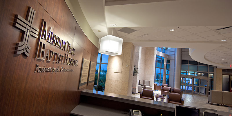
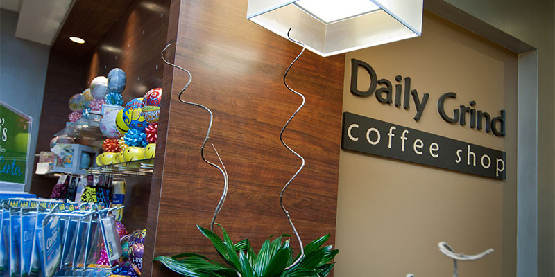
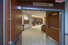
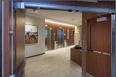
Mike Jones is a Project Manager for SWA Millwork, the fabricator that built many of the fixtures for the MTBH project. “We mainly produce nurse stations and reception desks,” says Jones. “And we receive a lot of specifications for decorative laminate because it offers so many different colors and designs. Woodgrain is usually the choice in a hospital setting because it feels homey, but if you were to use real wood or veneer plywood it just would not last as long.” The laminates were specified with a Class A Fire-rated particleboard substrate. And because the doors and drawers get a lot of use, the casework was built with concealed hinges. The public area doors in the hospital are done in Wilsonart’s Zanzibar laminate, a comforting design reminiscent of anigre with dark, gold and reddish hues. The design is carried over into Marlite panel systems along the walls, casework and accents within the patient rooms and nursing stations. Laminate in a warm, straight-grained Amber Cherry is used to soften the stark, white functionality of the back-of-thehouse doors, desks and casework. And a lighter Asian Sand design accents the nurse’s work alcoves, and nursing stations. This design also moves out into the corridor to the coffee shop and servery providing a very cohesive look.
Special care was taken to protect the edges of the laminate fixtures because of the heavy traffic in the hospital environment. The cabinets and doors were all finished with an impact resistant PVC edgebanding. But a different approach was taken for the nurse stations. “The owners were very concerned with the corners at the nurse stations getting dented,” says Rinehart, “so rather than cutting radiuses or adding corner protectors, we decided to extend the solid surface that was used for the desk tops down the sides, making it a functional design feature. Then we set the Wilsonart Laminate surface back into it, so there were no exposed laminate corners at the nurse stations. The intention was to keep it simple and easy to clean.”
“We Maintain a Healing Environment”
Another aspect of the MTBH’s vision is to maintain a healing environment. A growing body of research in evidence-based healthcare design supports the idea that the physical environment can relieve patient pain and stress, affect well being, promote healing, and reduce medical errors, infections and falls. An important component of this is designing healthcare spaces that feel less institutional and more familiar. “A big focus for us with the MTBH project was to be as hyper-local as possible with the south Texas culture,” says Lawson. “So that plays a big role in the design elements that went into the facility.” A physician-led art committee sought out photographs, paintings and quilts done by local artists. “Angela Rinehart sat on the art committee as well,” says Lawson, “so the selections of the finishes worked in concert with the artwork to achieve the general theme we were going for.” The warm wood tones of the Wilsonart HPL, and the strong neutral foundation of the solid surface set the tonal palette. “We used some interesting materials as accents to bring out the local flavor,” says Rinehart. “Along the stairwell is a wall that looks like a rock façade, but it is actually porcelain tile in a pattern called “horn.” We also used some Texas limestone, both honed and sandblasted, to tie into the geology of the area.”
Mission Trail Baptist Hospital takes its name from the unique history of the area. “We had a local artist do a mosaic tile outlay of the San Antonio River in the meditation garden that sits between the medical office building and the hospital,” says Lawson. “It depicts each of the missions along the way and shows where MTBH now sits along that trail.” Weaving these earthy elements throughout the interior of the facility and the grounds gives patients a sense of place, rather than a feeling of being removed from society because they are sick.
“We Are Family Friendly”
MTBH considers a patient’s family to be partners in the care of the patient. To this end, spaces are designed to be simultaneously open and private. Several devices are used to achieve this seemingly contradictory objective. The first is natural light, which streams into the public spaces in the facility through abundant windows and vaulted ceilings. Translucent materials were used to create areas of separation without blocking the light. “We ordered 4x8 sheets of resin panels in the Bear Grass pattern, basically tall grass with different variations of length and height, and cut them to size at our shop,” says Jones. The design was also added to some of the nurse stations to counteract the institutional feel of the back of the house environment. “The panels are aesthetically gorgeous,” says Rinehart, “but they really serve a function to help keep the spaces more intimate for patients and family. As hospitals become more like hospitality spaces, the look of organic materials like Wilsonart HPL, stone and grass really helps to counteract the institutional feel, and that is one of our goals.”
Another design objective was the designation of a “quiet hospital,” a relatively new concept that emphasizes noise control. “From a healing perspective, if it is loud and clangy and noisy, it is a pretty difficult place to get healthy,” says Lawson. “We used a lot of sound attenuating surfaces. And for sound dampening we put panels on the walls in areas that had an echo-y feel.”
All these details add up to serve the first tenet of the MTBH vision statement: “The patient is at the heart and center of MTBH. We exist to serve patients. Each one of us at MTBH is a caregiver and plays a role in our healing mission.” That philosophy carries through to the facility itself, and the team that carefully developed the healing environment.
Click here for a PDF of this case study.




Sign In
Register